Role
Lead Designer / Marketing
Timeline
June – Present (launched Sep 17)
Tools
Figma, Adobe Creative Suite, HTML/CSS, Claude
Team
Startup team of 3, working directly with the main engineers

Designing an AI-powered map for food discovery
Turns saved TikToks and Reels into a map of restaurants worth going to.


Turning Food Reels Into a Map of Places Worth Going To
Problem - Great Spots Vanish When You Scroll
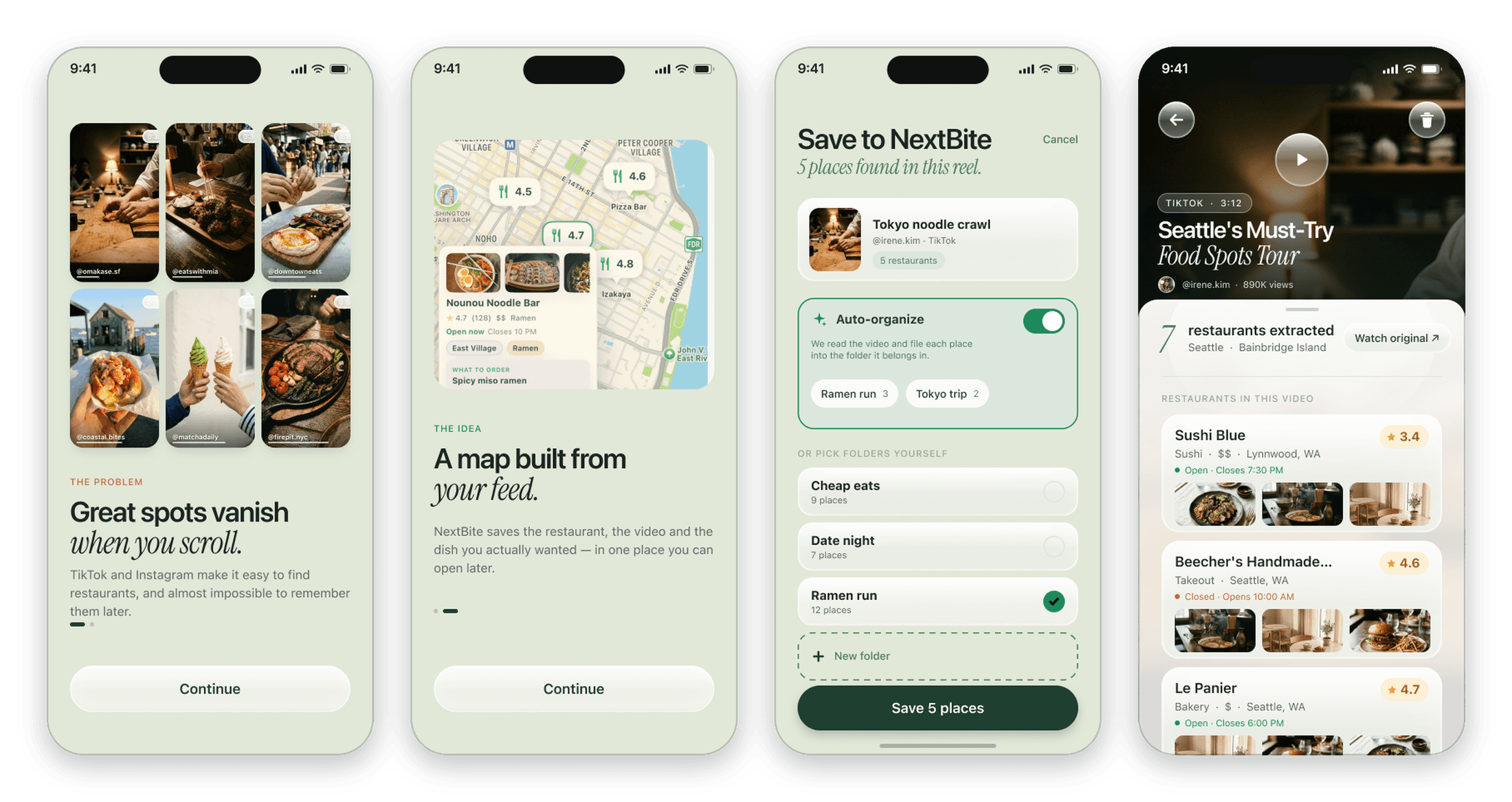
People find restaurants on TikTok and Instagram Reels every day, but those recommendations get buried in saved folders, screenshots, and group chats. When it is finally time to eat, the place is impossible to find again.
NextBite’s idea is simple: share a reel to the app, and we extract the restaurants from the video, then pins them to your own map.
Research - Saving Was Never the Hard Part
After the beta launch, I ran personal interviews with early users to see where the app broke down in real life, not just in a demo.
The biggest takeaway was that saving a place was easy, but deciding where to actually go was not. People had dozens of saved spots and no sense of which ones were worth the trip.
Common pain points included:
Saved places piled up with no way to tell which ones were actually good
Getting a reel into the app took more taps than it should
Friends’ real opinions mattered more than view counts
The Original App - Where It Started
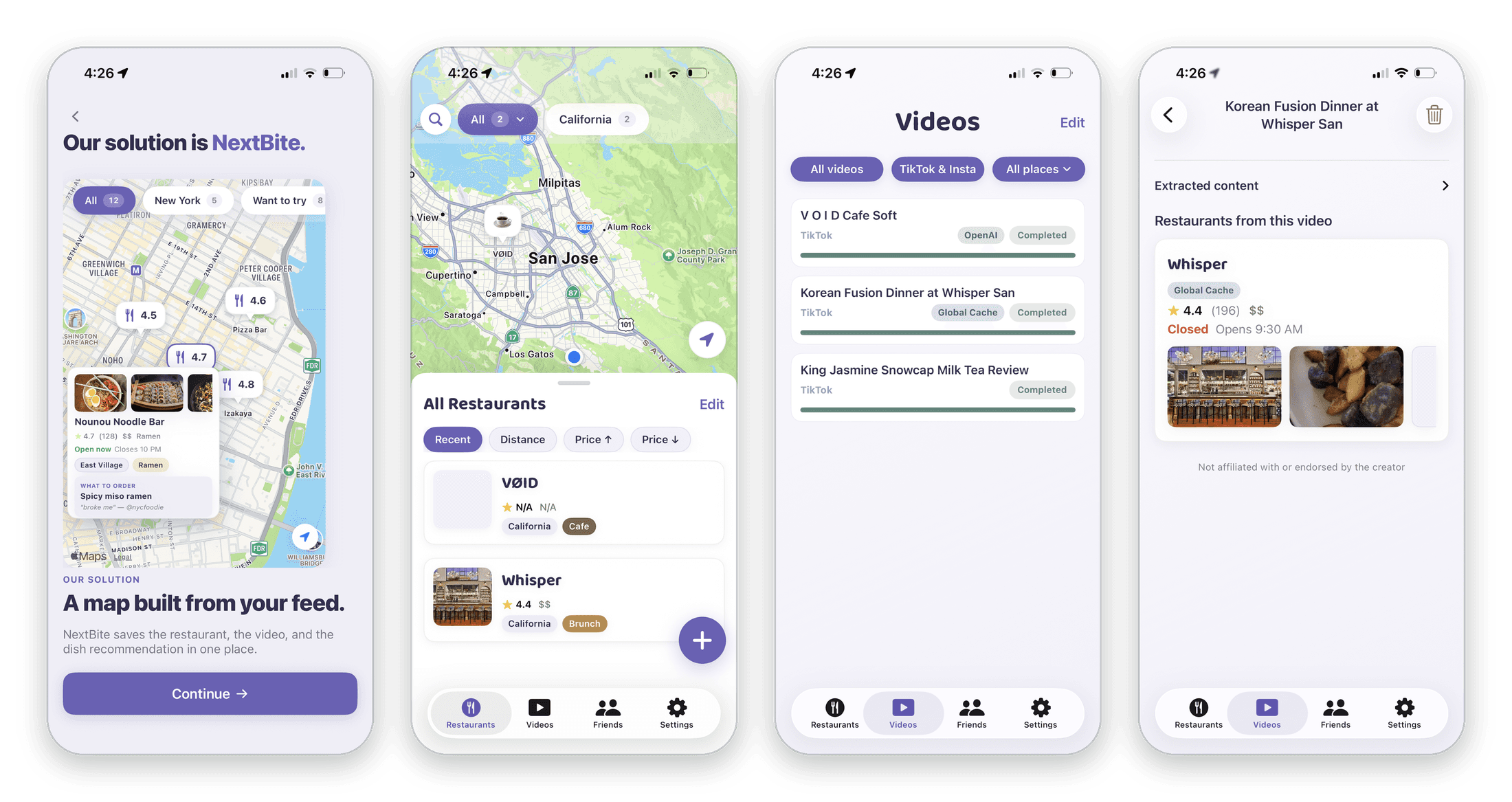
The first version proved the core idea worked: share a reel, and the restaurant shows up. But the experience stopped at saving. Places landed in long lists split between restaurants and videos, with nothing that brought people back after the first save.
Redesign - Save It. Go. Rank It.
I redesigned the entire user flow around one loop: save a place from a reel, go eat there, then rank it against the places you already know. Every screen in the new flow pushes toward the next step of that loop.
Saving now takes one share. The app finds every place in the video and can auto-organize them into folders, so there are no extra decisions to make.
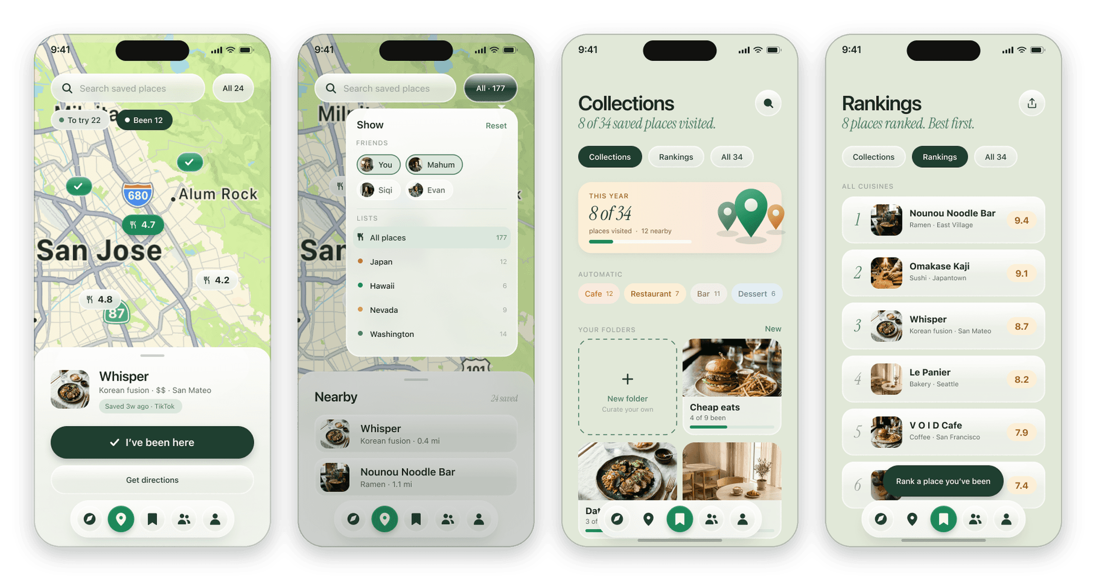
Marking a place as visted starts a quick ranking. Instead of star ratings, you compare it to a place you already ranked. People are bad at scoring things out of five, but good at “which was better?”, so the list ranks itself.

The map became the home screen. Pins show been vs to try at a glance, and collections and rankings show real progress, like 8 of 34 places visited.
New Features - Discovery & Profiles
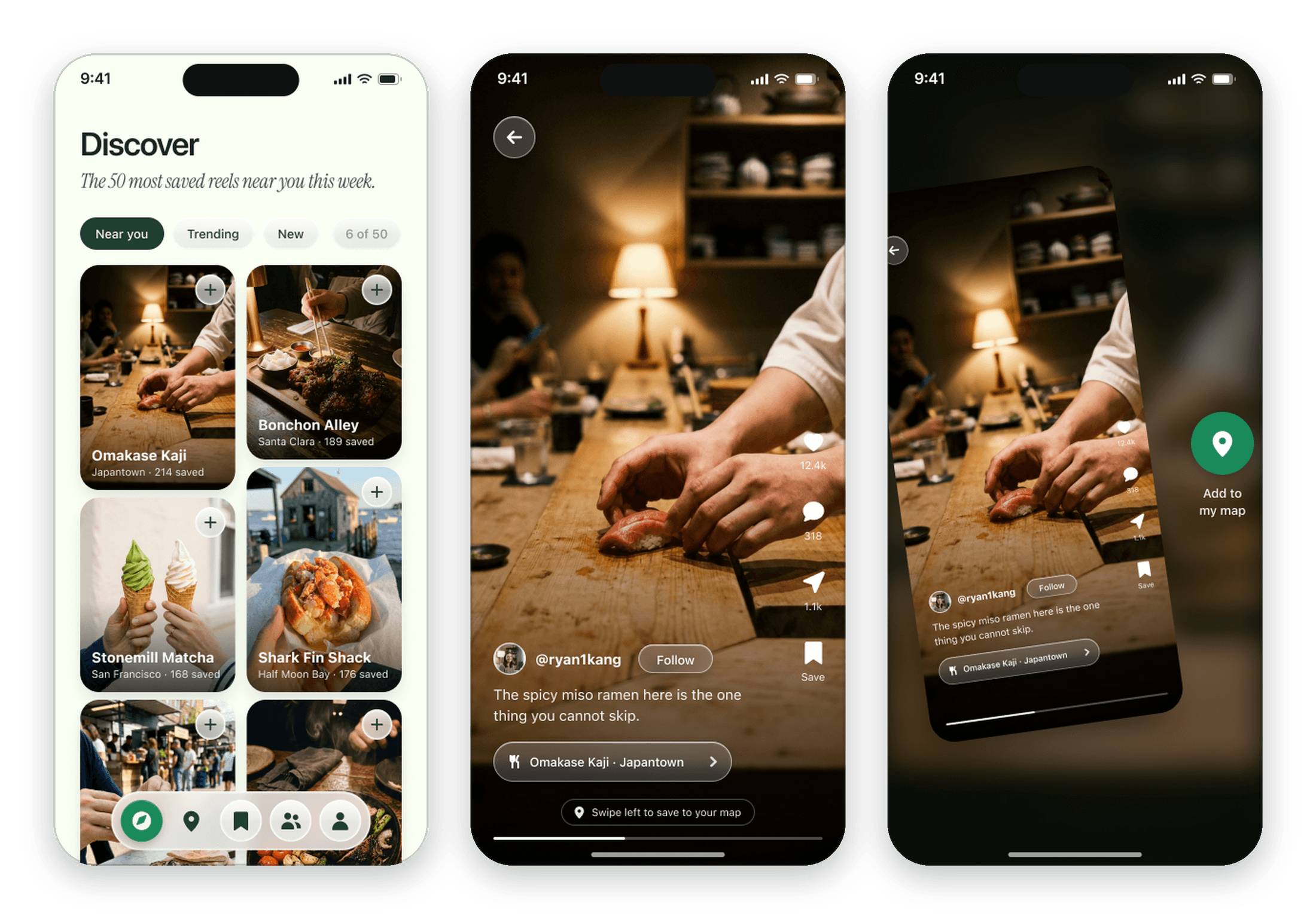
I also designed the discovery. Discover surfaces the most saved reels near you, and saving a place works the same way you found it, with a single swipe.
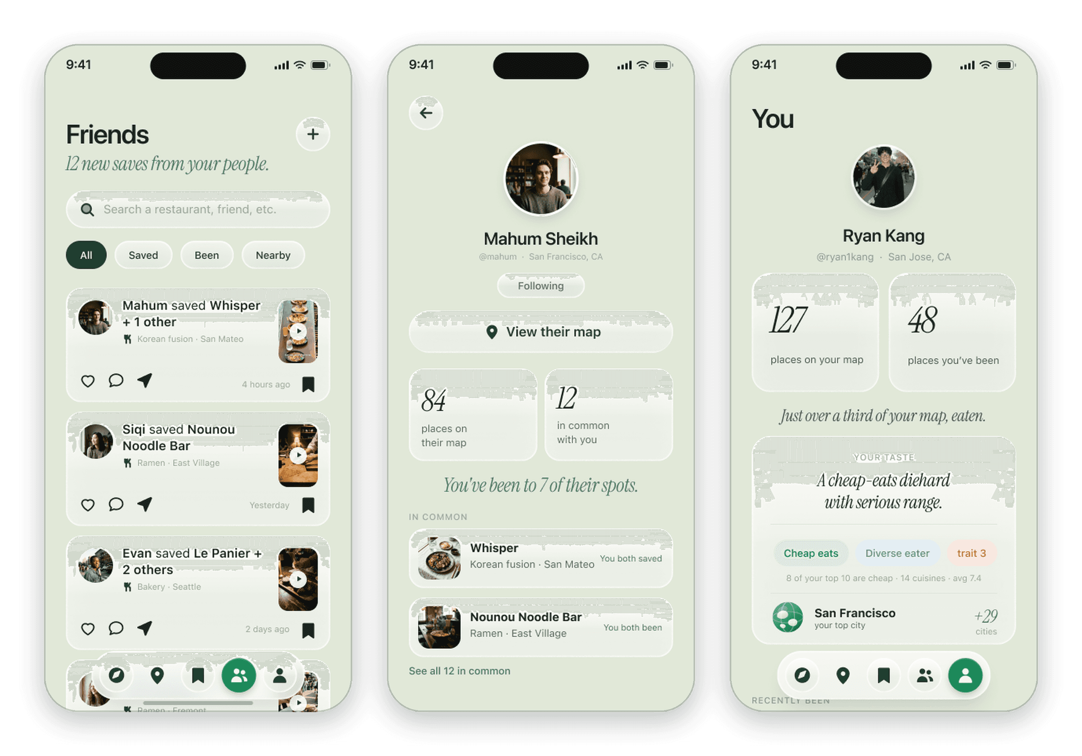
On the social side, I designed the Friends feed and profile pages. Instead of an endless activity feed, friends show up as proof: the places they have actually been, and what you have in common.
Design System - Cream, Pine & Liquid Glass
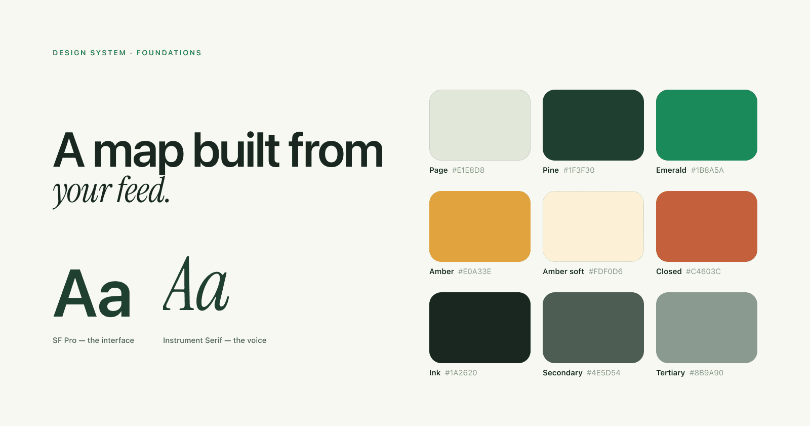
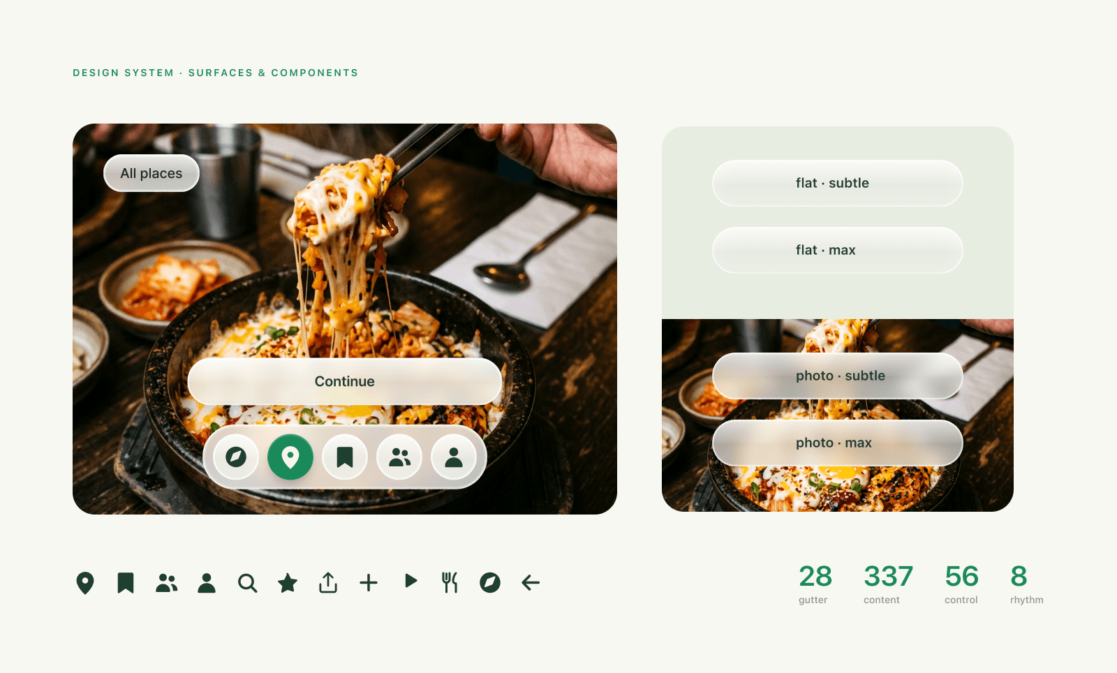
A quiet cream page so the food photography does the talking, SF Pro with an Instrument Serif voice, and liquid glass that only shows up where something sits behind it.
Marketing Graphics - App Store & Instagram
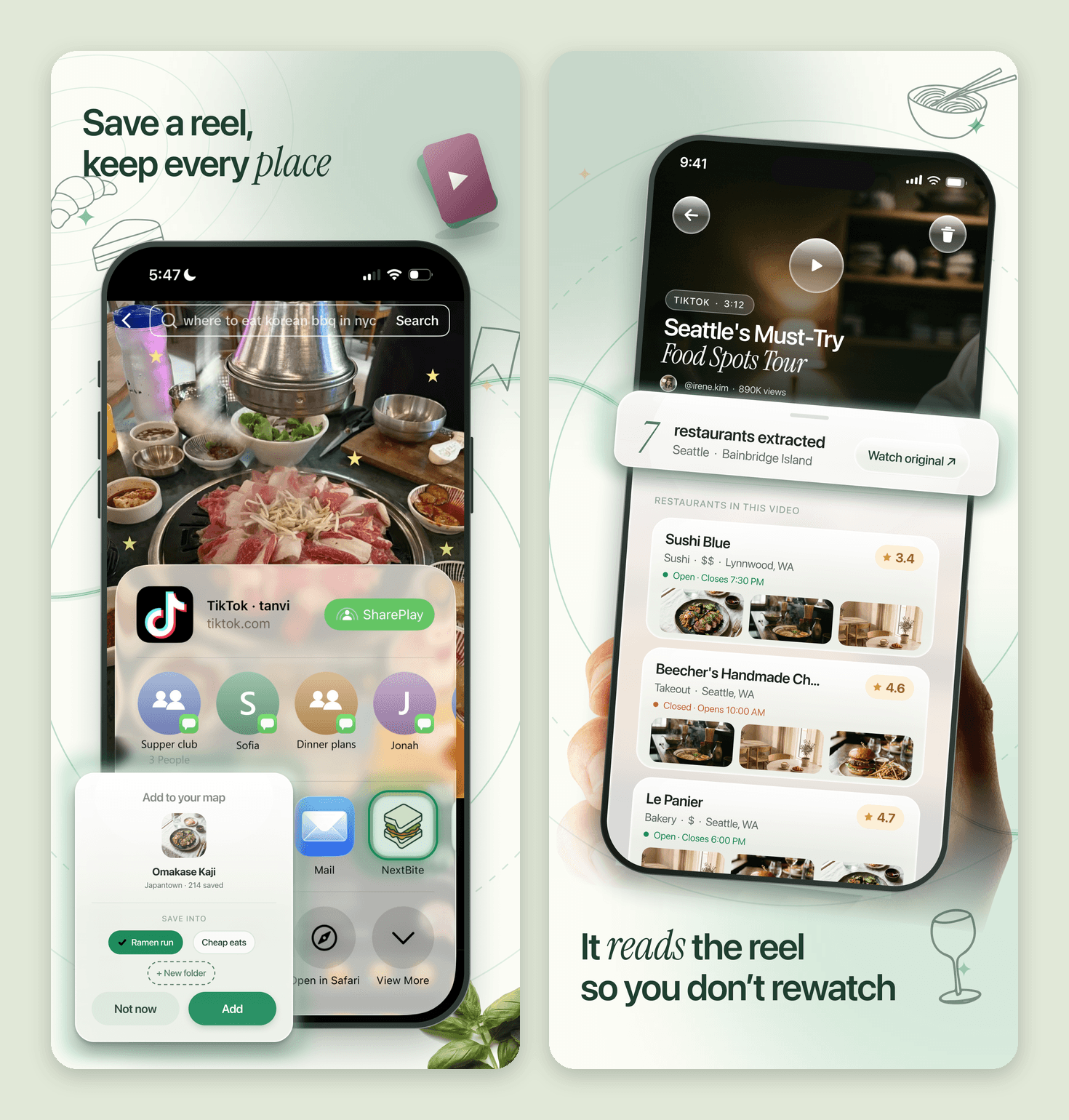
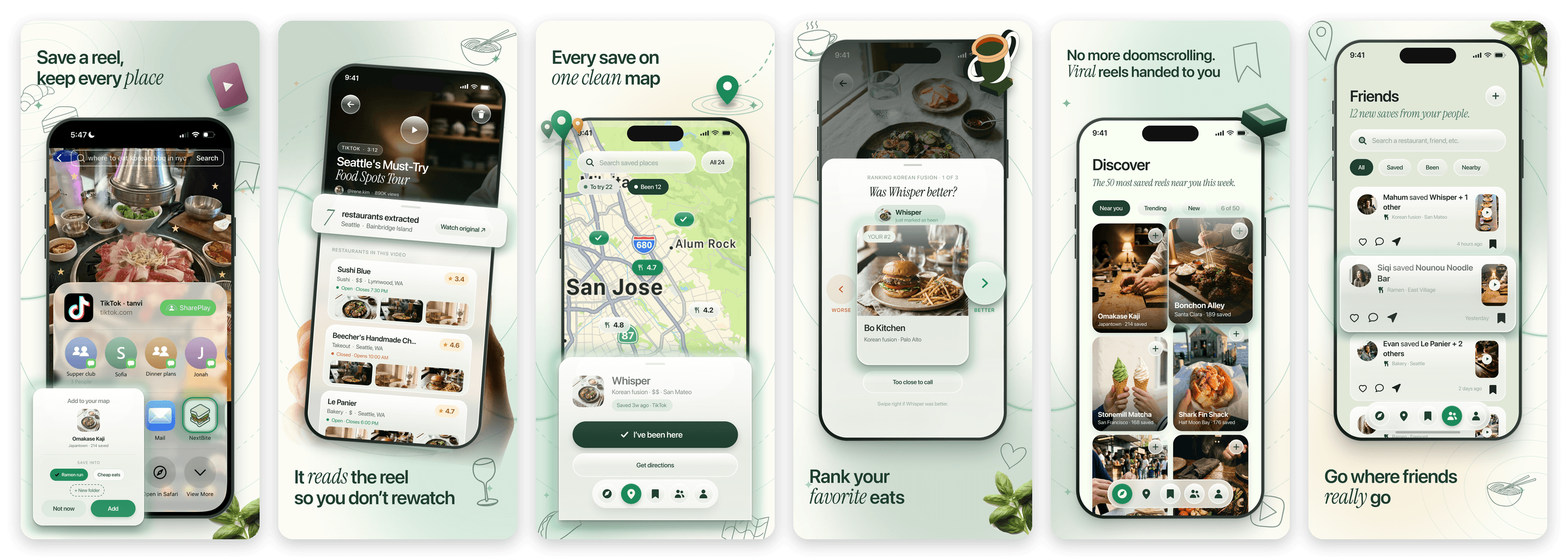
As the Marketing Lead, I designed the graphics that introduce NextBite to new people. The App Store screenshots tell the whole story in six frames: save a reel, let it read the reel, see every save on one map, rank your favorite eats, discover viral spots, and go where friends really go.
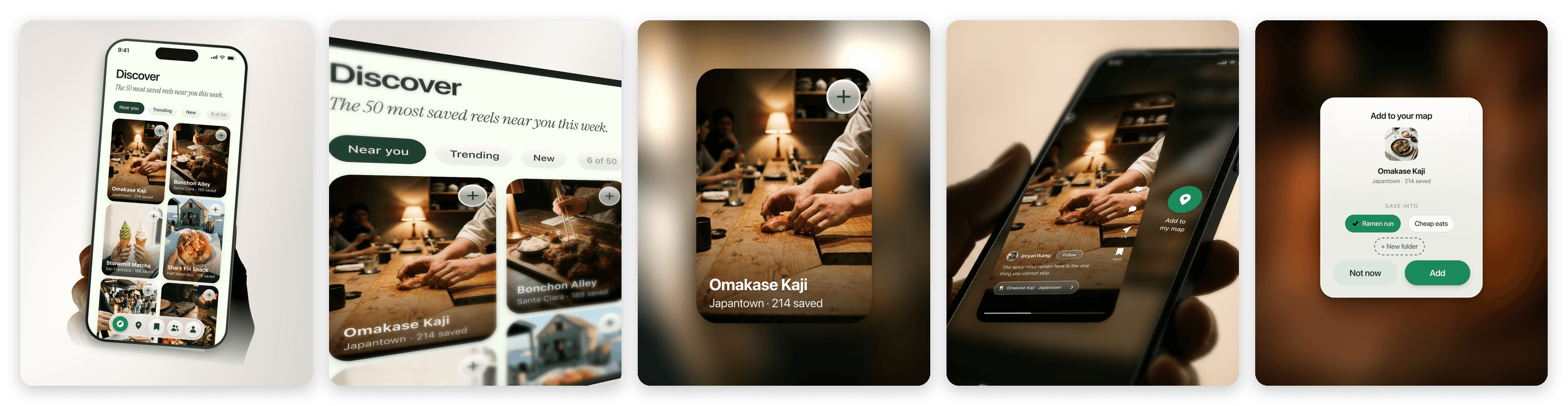
I carried the same look into Instagram posts and stories, with close-ups of the real product, like the Discover grid and the add-to-map card, so every graphic points back to something you can actually do in the app.
Launch - Bringing It to the App Store
NextBite launched on the App Store on September 17, 2026. I also made the launch video, walking through the whole loop from saving a reel to finding the spot.
Turning Food Reels Into a Map of Places Worth Going To
Problem - Great Spots Vanish When You Scroll
People find restaurants on TikTok and Instagram Reels every day, but those recommendations get buried in saved folders, screenshots, and group chats. When it is finally time to eat, the place is impossible to find again.
NextBite’s idea is simple: share a reel to the app, and we extract the restaurants from the video, then pins them to your own map.
Research - Saving Was Never the Hard Part
After the beta launch, I ran personal interviews with early users to see where the app broke down in real life, not just in a demo.
The biggest takeaway was that saving a place was easy, but deciding where to actually go was not. People had dozens of saved spots and no sense of which ones were worth the trip.
Common pain points included:
Saved places piled up with no way to tell which ones were actually good
Getting a reel into the app took more taps than it should
Friends’ real opinions mattered more than view counts
The Original App - Where It Started
The first version proved the core idea worked: share a reel, and the restaurant shows up. But the experience stopped at saving. Places landed in long lists split between restaurants and videos, with nothing that brought people back after the first save.
Redesign - Save It. Go. Rank It.
I redesigned the entire user flow around one loop: save a place from a reel, go eat there, then rank it against the places you already know. Every screen in the new flow pushes toward the next step of that loop.
Saving now takes one share. The app finds every place in the video and can auto-organize them into folders, so there are no extra decisions to make.
Marking a place as visted starts a quick ranking. Instead of star ratings, you compare it to a place you already ranked. People are bad at scoring things out of five, but good at “which was better?”, so the list ranks itself.
The map became the home screen. Pins show been vs to try at a glance, and collections and rankings show real progress, like 8 of 34 places visited.
New Features - Discovery & Profiles
I also designed the discovery. Discover surfaces the most saved reels near you, and saving a place works the same way you found it, with a single swipe.
On the social side, I designed the Friends feed and profile pages. Instead of an endless activity feed, friends show up as proof: the places they have actually been, and what you have in common.
Design System - Cream, Pine & Liquid Glass
A quiet cream page so the food photography does the talking, SF Pro with an Instrument Serif voice, and liquid glass that only shows up where something sits behind it.
Marketing Graphics - App Store & Instagram
As the Marketing Lead, I designed the graphics that introduce NextBite to new people. The App Store screenshots tell the whole story in six frames: save a reel, let it read the reel, see every save on one map, rank your favorite eats, discover viral spots, and go where friends really go.
I carried the same look into Instagram posts and stories, with close-ups of the real product, like the Discover grid and the add-to-map card, so every graphic points back to something you can actually do in the app.
Launch - Bringing It to the App Store
NextBite launched on the App Store on September 17, 2026. I also made the launch video, walking through the whole loop from saving a reel to finding the spot.